The Mood Board Is Not the Offer
A mood board can clarify visual direction without deciding your offer. Use a simple sorting method to turn references into focused creative choices.
You have saved a dozen images of smoky blue glaze, folded linen and pale timber. They look like they belong together, but a customer still cannot tell what the work will look like. A mood board for a creative offer is most useful when it helps you make and explain visual decisions.
Think of the board as a working instrument, not a miniature catalogue. Its job is to show which visual qualities you intend to explore, which references are only prompts and where the actual work must differ. That makes the board useful to you and easier to discuss with a customer, without asking it to define the business terms.
Use references to make visual decisions
A reference can point to a quality without serving as a model to copy. A photograph might suggest the contrast between a matte surface and a glossy edge, the way a folded form catches light, or the calm feeling of a pale background.
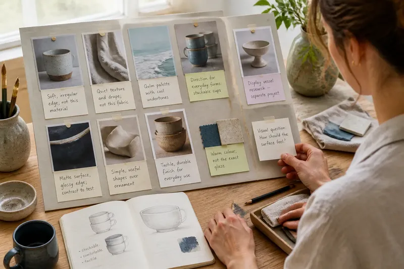
Write a short note beside each image. Name the quality you want to consider, then distinguish it from details you are not adopting. For example: “soft, irregular edge; not this material” gives a clearer prompt than saving the image without explanation.
That note turns browsing into a choice. Keep an image only if you can name the visual question it helps you answer.
The board contains competing directions
One group of images may suggest quiet, durable forms; another may point towards ornate, playful work. The problem is not variety by itself. It is that the references may be addressing different visual aims, so combining them leaves you unsure which qualities should guide the next decision.
Sort the images into clusters, then give each cluster a visual question: “What should the surface feel like?” “How much contrast belongs in the palette?” “Should the shape feel restrained or expressive?” If a cluster points to a separate project, move it into an archive rather than blending it into the current board.
Imagine a ceramicist has gathered references for stackable cups alongside images of delicate display vessels. They mark the cups as the direction for everyday forms and move the display references into a second folder. The resulting board now guides decisions about the cups without asking them to serve two different visual purposes.
Separate an influence from a promise
Images can suggest materials, finishes or custom details that are not part of the work. A polished photograph may also conceal how a surface behaves in ordinary use. Without a note, a reference can be mistaken for a specification.
Mark what is borrowed and what is not. “Warm colour, not the exact glaze” or “soft drape, not this fabric” makes the distinction visible. When a decision depends on a product label, maker’s instructions or local rules, check the relevant source before choosing a material or process.
If a reasonable viewer could mistake a reference for an image of the finished work, label it as an influence or replace it with a clearer one.
Give the board a clear boundary
New images can keep shifting a project before any visual choice has settled. Set the board’s purpose first: perhaps it covers colour and surface, while packaging and display belong elsewhere. Keep an archive for good references that do not serve this particular purpose.
Before adding an image, write the decision it might inform. If you cannot name one, leave it out for now. A compact board with distinct roles for its images is easier to use than a large collection that points in several directions.
Say you are developing greeting cards and have saved images of packaging, shop displays and illustrations. You decide the current board is for illustration style, keep references that clarify line and colour, and move the rest into separate folders. The expected result is a board that helps with drawing decisions rather than pulling the project into packaging and display work.
How do you use a mood board without confusing its purpose?
What should a mood board show?
Choose references that clarify visual qualities relevant to the work, such as colour, shape, surface, setting or tone. Add a brief note that says what each image contributes.
Should a mood board include photographs of finished work?
It can, if existing work helps explain the visual direction. Keep photographs of finished pieces distinct from references that are only influences, so viewers can tell the difference.
How do you keep a mood board from becoming too crowded?
Give the board one purpose and ask what decision each image supports. Move references that answer a different question into an archive or a separate board.
Can a customer contribute to the visual direction?
Yes, when the discussion concerns visual choices that are open for input. Make clear which references are prompts and which decisions are already set, so the board does not imply that every detail is available to change.
Use the board to steer the next creative choice
A useful board does not need to settle every detail. It should make the next visual decision easier to see. Compare the references, the notes beside them and the work in progress; if they point in different directions, decide which visual quality matters for this project and revise the board accordingly.
For a creative offer, the board’s value lies in making visual intentions discussable. Keep the broader offer and its terms clear elsewhere, and let the board do the narrower job it handles well: showing what kind of look you are moving towards and which choices still need attention.
When you add the next reference, write down the visual decision it is meant to inform. If it cannot help with that decision, save it for another project rather than letting it quietly redirect this one.